
Morgan
Designing Design Systems
Almost every single project I’ve worked on over the past 8 years has involved a design system. I’ve met some designers who feel that design systems are only necessary (or only practical) on mature projects, with large teams, and possibly even a dedicated “design systems” team. And to this I say no! Design systems can—and with the right team, should—be part of a small MVP from day 1.
The primary benefit of design systems is that they solidify interaction patterns across a product. Why is this good?
First, this speeds up design time, because you’re not starting each feature from scratch. You’re standing on the shoulders of giants (the giant here being the design system you just made). Whatever you’re designing, the less time you’re wondering how a form should look and feel, the more time you have to consider the actual problem. Or if you don’t want to spend more time, just ship twice as fast. Either way you win.
Second, solidifying interaction patterns makes your product easier for your users to learn. When I joined Deputy, every single page on their web app had a completely different layout.
“Where’s the primary action for this page?”
“Dunno.”
Every time they visited a new section of the product, they had to start learning from scratch. Once we’d finished, there was ✨consistency✨ across the product. This meant that as we started to add new features, we didn’t have to add boring onboarding videos that no-one watches, or those torturous “click here” lightbox effects. The users knew how to use the new features, because they knew how to use the rest of Deputy. At most a few empty states and tooltips did the job of educating the gap.
Third, this whole adventure also speeds up development time. Once your design system is fairly mature, your goal is to be able to give the developer a screenshot of your design, and they can code it up without any back-and-forth between you. Later on—and this is where it gets really cool—the developers don’t even need a designer. “Oh we need a modal window with a form in it? I’ll just check the docs and chuck it together, and then send it to the designer to review”.
If you haven’t received a PR from a developer who’s just designed a new feature without any input from you, you’re missing out. Here’s an example I woke up to one day. The developer who made this does not know CSS.
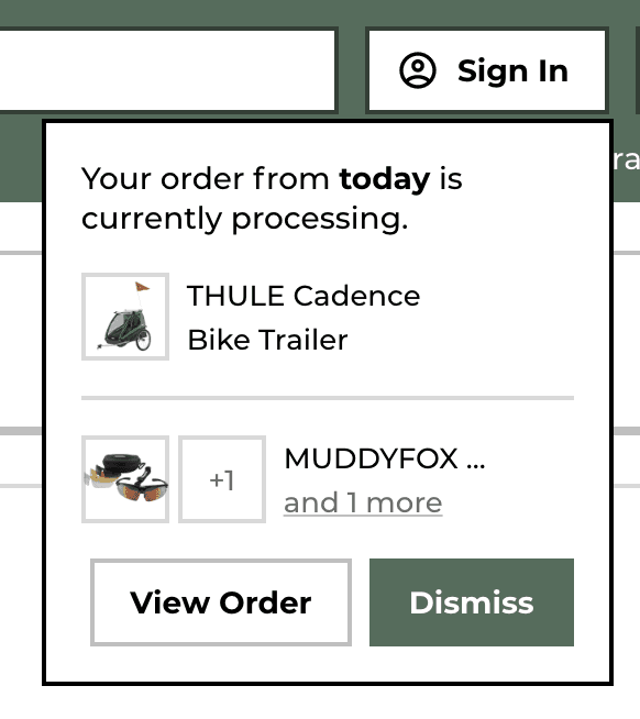
This handy modal updates the user on the state of their most recent order, when they return to the site.
Now with all I’m crowing on about them, you might think design systems have no drawbacks. Unfortunately, they do.
The primary drawback with design systems is that they don’t only limit how bad your designs can be, they also limit how good they can be. Even if there’s no rigid top-down enforcement of the system, the fact that it’s there means that as a designer, you’ll often immediately jump to use the design system before exploring other options.
When working on Propflow, we started with Shopify’s Polaris design system. We quickly found that Polaris began to steer the direction of the design. The components were so good that they became the “obvious solution” that then removed the need to explore alternate solutions. Kyle Peatt, who works on Polaris, wrote about this elegantly in “The system always kicks back”.
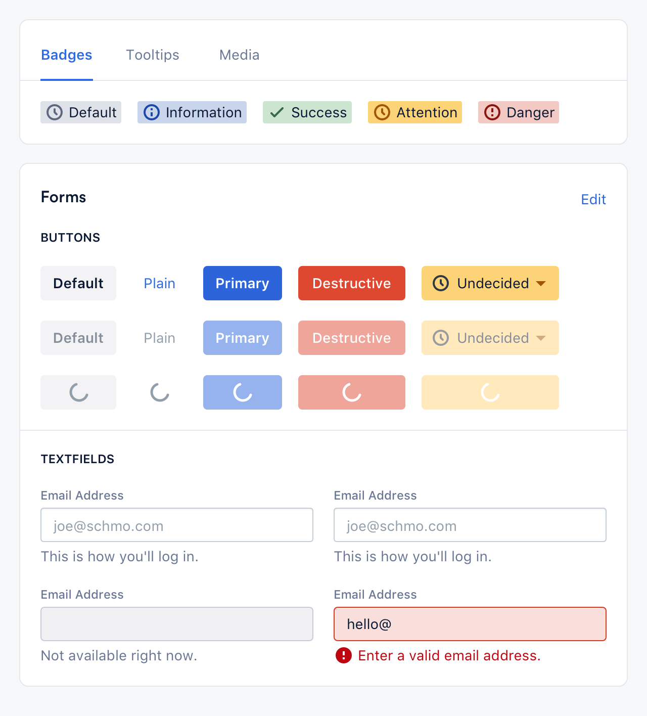
Propflow’s Design System, based on Polaris
If you can become aware of this happening, you can stop it. However this is probably easier done with small teams, where the designers creating the system are the same ones using it. Once you start to scale, and you have explicit “design systems” teams, you’ll need to have a healthy feedback loop between the creators and the users of these design systems, and encourage a bit of rebellion.
There’s an analogue here to predictive processing, our current theory on how the brain works. The senses send bottom-up sensory data to the brain, and the brain sends top-down models downwards. If there’s a conflict between the two, one has to win out. Sometimes the the top-down model wins out. That’s why you literally didn’t see that I wrote “the” twice in the last sentence. Other times, the sensory data wins, and updates the top-down model. But without that balance, the system either becomes completely chaotic and unusable, or rigid and fragile.
So if a design system is something like a brain, we can maybe approach developing design systems similarly to how the body approaches developing brains. That is: when they’re young, let them be soft, malleable, and strongly reactive to new data. As they mature, and are exposed to enough time and variability without failing, let them take a firmer, more confident stance, less reactive to bumps on the road, while still allowing for the occasional shake-up to reevaluate and reposition.