Fulfilling a childhood ambition and a gap in the market

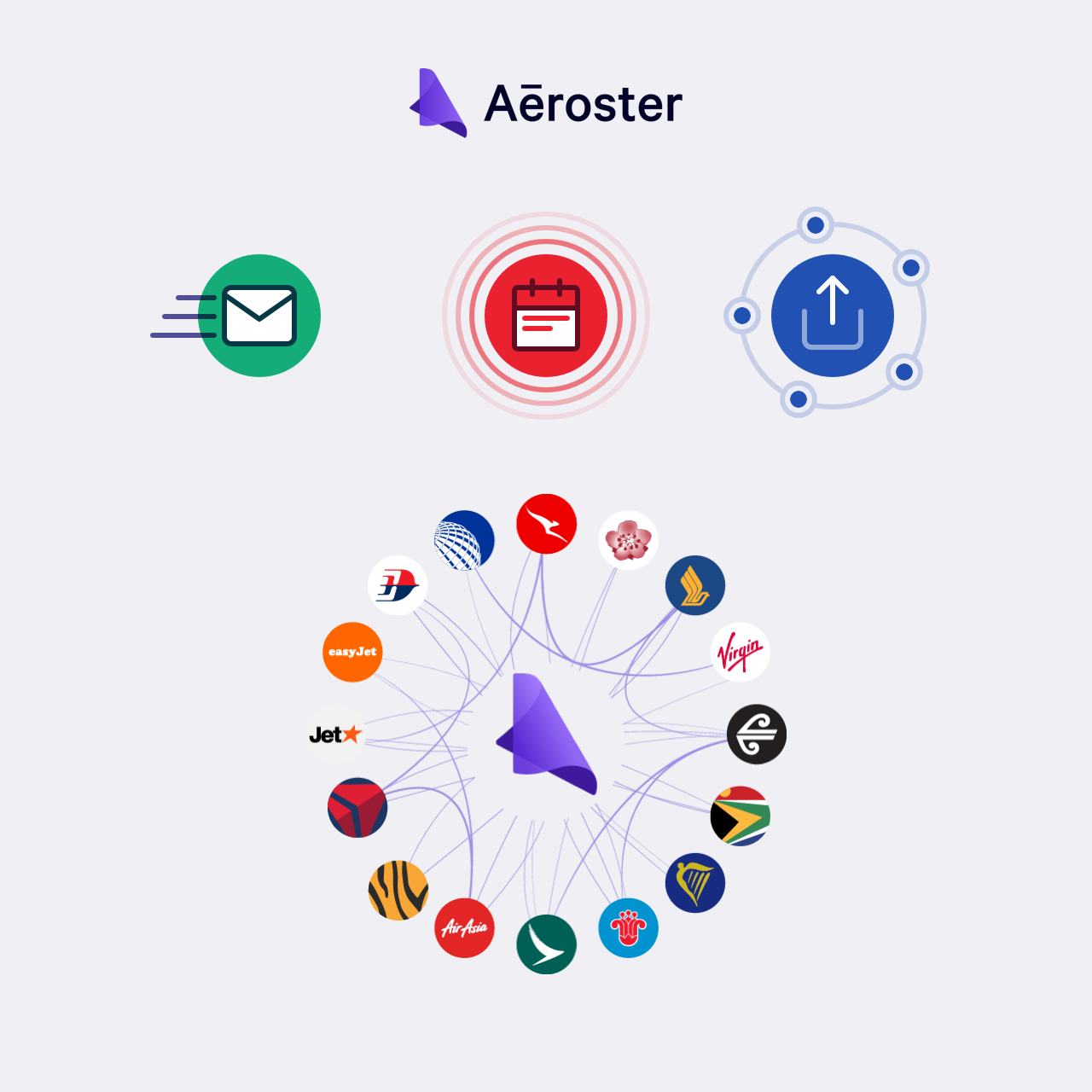
Smarter rosters for pilots and cabin crew
A 10 week accelerated sprint
Chris approached me to help design an app he’d been thinking about since he was a kid. His dad was a pilot, and was in and away from home non-stop. The golden rule was the roster, but they were incomprehensible, especially to a 6-year-old.
Chris had been accepted into the Qantas AVRO Accelerator Program. He had 12 weeks in total, and he was already two weeks in. We needed to build him something to present to investors at the end of the program.
Pair designing
I can’t take all the credit for this one
Thank you Emila :)
Unfortunately, I was tied up with other projects and wasn’t able to start working immediately. Chris’ schedule was tight, so I got some help from my friend and excellent designer Emila. She worked the first few weeks designing the wireframes and user flows, and then I took over. So I had a pretty good base to start with.
A sudden re-brand
Out with the new, in with the newer
Chris had contracted out branding to an agency, so my first step was to start turning Emila’s wireframes into hi-fidelity designs using the branding as a basis. However, it quickly became apparent that the branding didn’t suit the product.
-
This was my first iteration. There’s nothing wrong with it, but the cartoony style detracted rather than added to the function of the app.
-
Chris and I sat down for about 3 hours and turned that into this. Much better.
-
The final version looked like this.
This was my first iteration. There’s nothing wrong with it, but the cartoony style detracted rather than added to the function of the app.
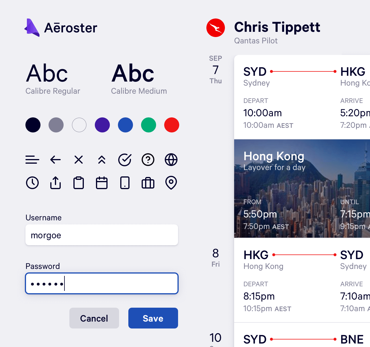
After our radical redesign, Chris dumped his old agency, hired a new guy, and produced an incredible logo. We picked fonts, colours, icons, and produced a coherent, clean design system.
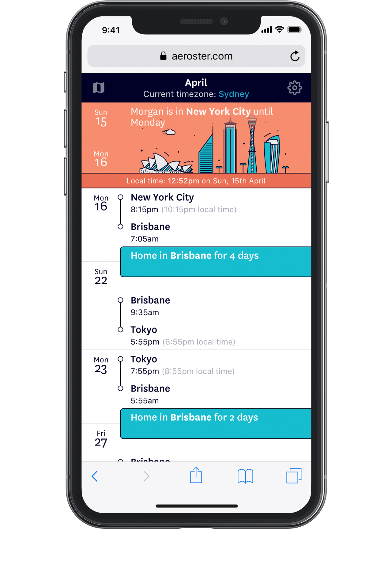
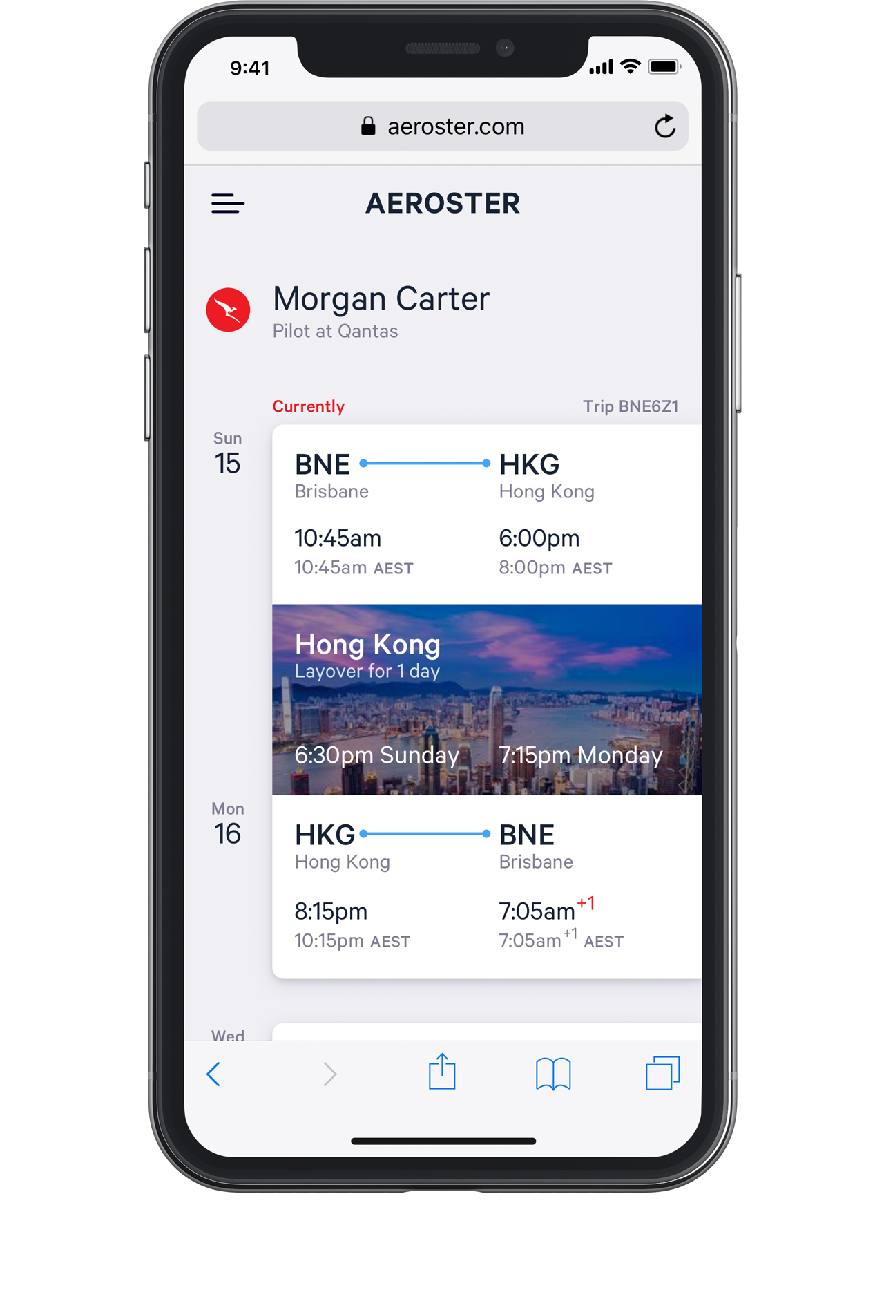
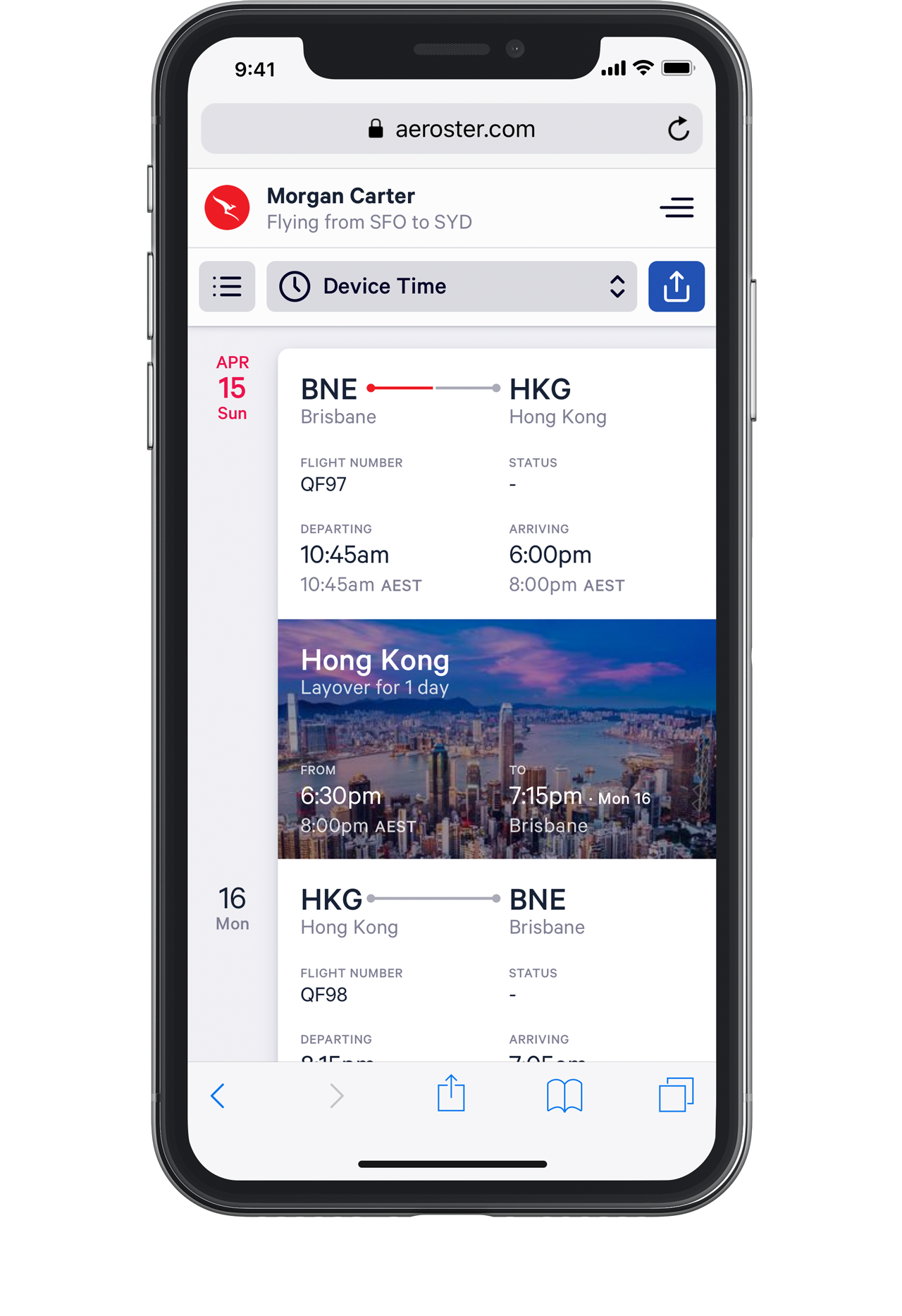
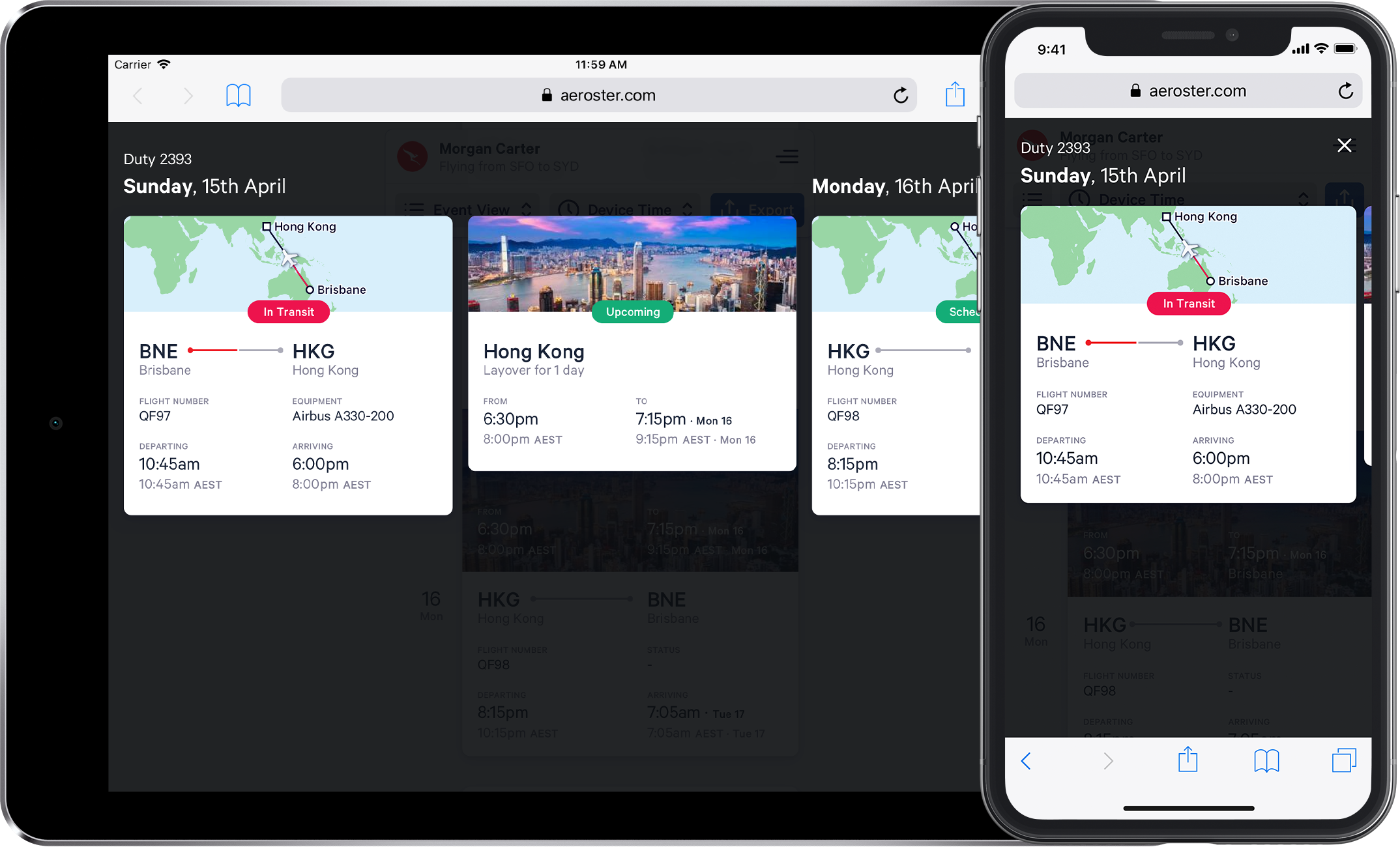
Mobile-first, desktop-best
Something something subtitle
With such a short time, and wanting to cover as much ground as possible, we went with a web application (Vue+Django), but focused on mobile users. The desktop version made proper use of the available real estate, but there’s nothing you can’t do on mobile.
Quick-n-beautiful illustrations
Something something subtitle
I’m no illustrator, but we needed illustrations. I used our chosen icon pack as a base to create some simple, beautiful illustrations that we could pepper throughout the app.