Project goals
What are we actually trying to do here?
My task was to lead the third iteration of the software - Deputy 3. This iteration had a few major goals:
- It needed to support all features of both Deputy 1 and 2, while at the same time simplifying the UI
- It had to unify the design and product development of the desktop, tablet and mobile apps that had drifted apart over the years
- It had to work on any device (previous iterations were fixed-width, desktop-only apps)
- We needed to update from Bootstrap 2 to 3, which meant rewriting the CSS codebase from scratch
- It had to be more fun, inviting, and intuitive.
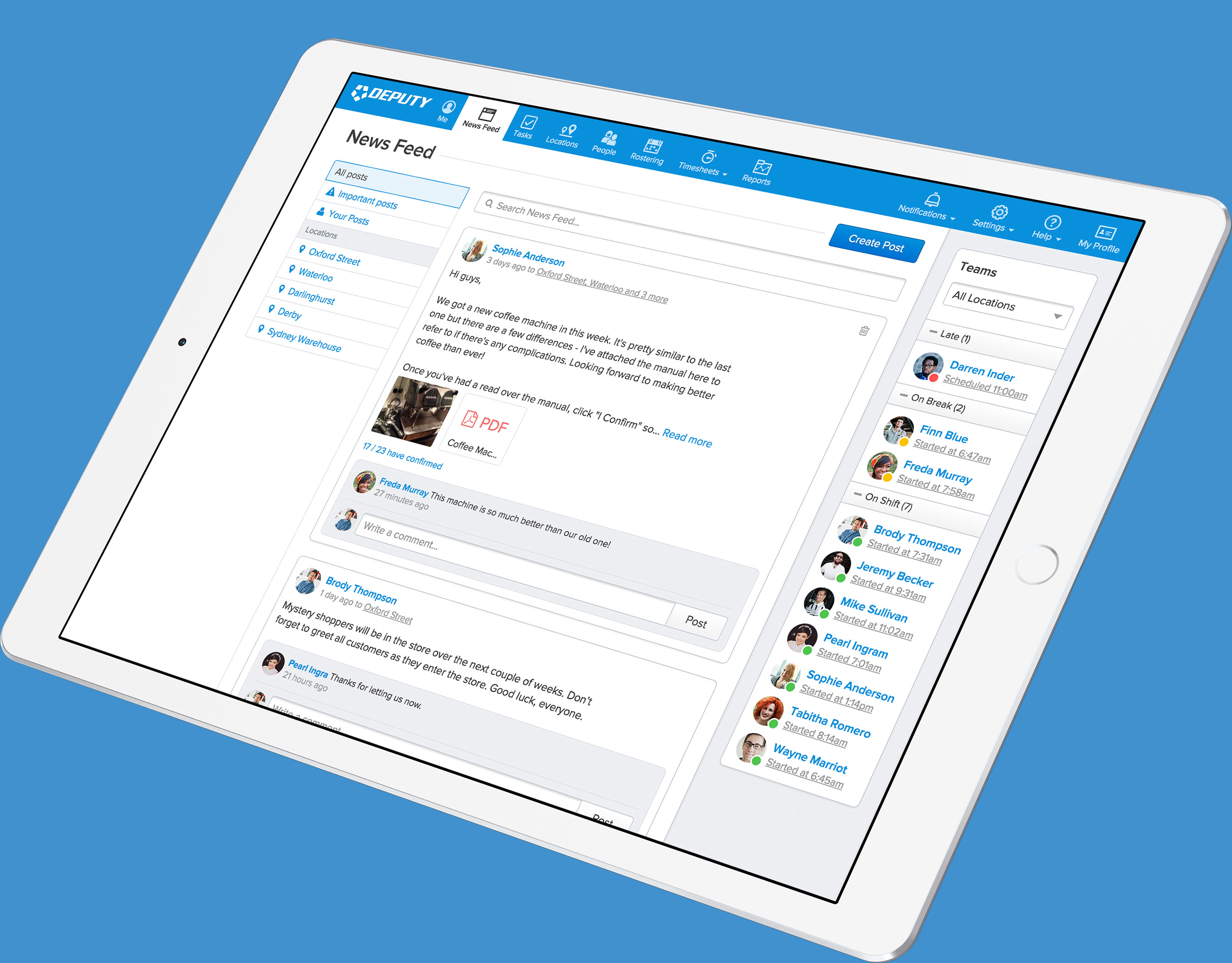
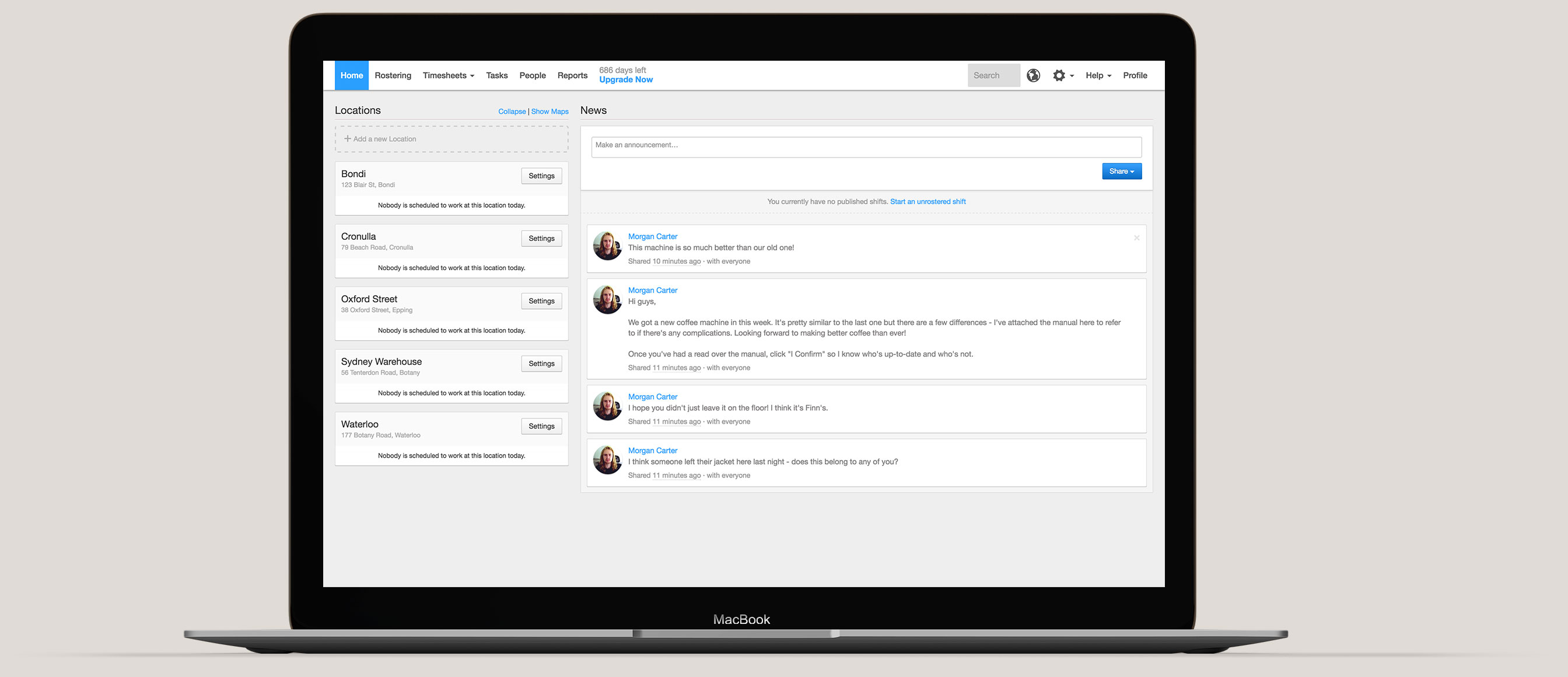
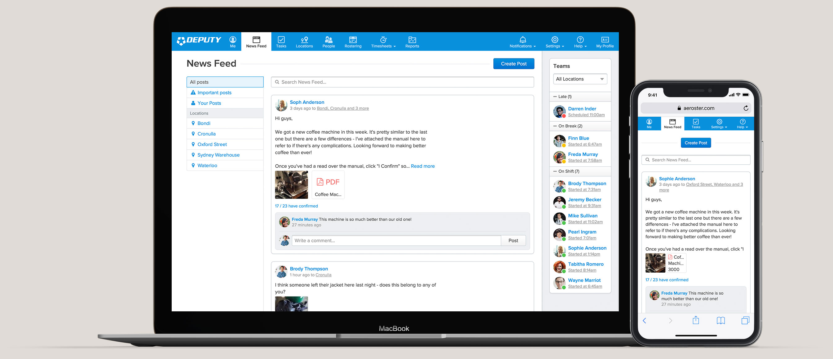
On top of all of this, we were also implementing new features. We planned to expand the functionality of the News Feed, adding comments and attachments; this would be rolled out simultaneously with updates to the mobile and tablet apps. We also added an easy way for employees to view past timesheets, upcoming shifts, see who they’d be working with, and claim open shifts.
And we only had 6 months.
Getting to work
and down to business
One of the benefits of working with start-ups is that there’s always someone new joining. I like to take these new employees and test the product with them while they’re still fresh-faced.
This user testing allowed me to focus my efforts on the aspects of the product most people found confusing. With tens of thousands of people using Deputy, I didn’t want to fix what wasn’t broken. The response we’ve received from the majority of users indicates we were successful here.
Once we had some direction, I started work on all three aspects of the project - code, user interface, and visual style. I like to alternate my focus. It’s useful to remove the restrictions of a developer mindset and focus purely on the design. I don’t usually bother with prototyping applications, as I can code up a functional prototype quickly, and once it’s in the browser it’s much quicker to edit data and design details.
Challenges
Potholes, hurdles and pitfalls
The project really challenged my ability to design on a micro and macro level simultaneously. One moment I would be organising the information architecture, fitting each of the features where it made the most sense, and the next I would be researching and testing how best to provide affordance for a particular button.
Macro design - card sorting helped us place each feature in its ideal place within the navigational structure.
Micro design - the iteration of accordion buttons.
One problem we ran into again and again was the lack of time. A few really interesting ideas ended up being pushed out, but might get revisited later on. One idea that got cut was an ‘inline modal’. We needed a way to place a modal over a modal over a page, so I came up with the solution of making the first modal inline, not overlaid. Below is a messy prototype, but it demonstrates the solution pretty well.
Inline modal inspired by Material Design's use of animation.
Another major issue was that we were trying to bring the desktop visually in line with the mobile apps, but many design decisions simply didn’t translate from mobile to desktop. We started by questioning some of the assumptions that had been made previously, and we ended up overhauling some key aspects of the mobile apps and meeting the designs in the middle.
Results
40k to 270k users in 1 year
In the end we finished coding right on the 6 month mark, and after a few weeks of QA, we launched in June. I was expecting a substantial amount of push-back, as it was a massive redesign (and I’ve seen how Reddit reacted when the design team increased the font size by 1px), but the response to the new version has been really positive. With this new release, and a few other key strategies, Deputy has gone from 40,000 users to 270,000 in less than a year.
Of course, this is just the beginning. Shipping a new version or feature will always bring really valuable feedback, and constant iteration is the key. I’m looking really forward to seeing how Deputy continues to develop.
Update: Deputy continues to do well and has recently secured their first investment, a cool $25 million. Their future looks bright.