
Morgan
Which Input When?
The inputs we interact with in real life follow some pretty basic rules, and we can get really confused if they don’t. If you’re trying to manipulate the temperature of a tap, for instance, only the range slider input makes sense. But if you were trying to manipulate the temperature of your kettle, it’d be best to use the steppers on the right.
Unfortunately, what can seem obvious in real life can get confusing when we move to software. Software is more abstract, and can deal with really complex sets of data that simply don’t appear in your kitchen. Here are some simple rules which can help guide which type of input you should use when, to make your design as intuitive to use as possible.
Input Field
The input field is the bread and butter of forms. They’re used for anything that requires custom input from a user, not a selection of predefined options. Usernames, emails, addresses, passwords, websites, phone numbers.
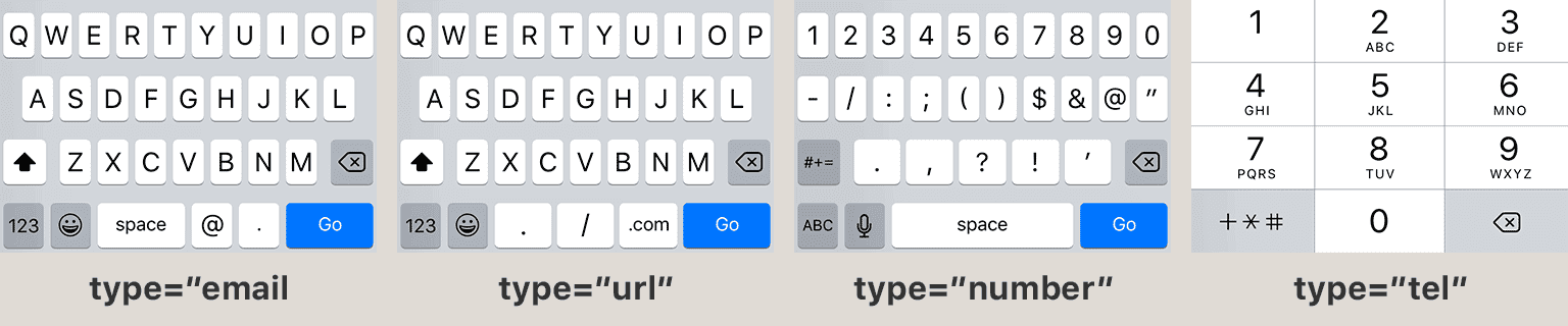
Make sure you use the correct HTML5 input when using input fields. They fall back gracefully on old browsers, and on new browsers (particularly mobile) they’re great for helping users to enter in the correct type of information.
Auto-completing Input Field
An auto-completing input field looks pretty much like a standard text input field, but once you start typing, it suggests some relevant options. When you have potentially hundreds of options (too many to display on-screen at once), an auto-completing input field is a good choice. A good use-case for this would be asking a user’s home country. Once the user starts to type, the input filters the hundreds of options down to a few relevant ones, allowing the user to easily select the one they’re after.
This is not a standard HTML input type, so you’ll need to use a plugin like Chosen.
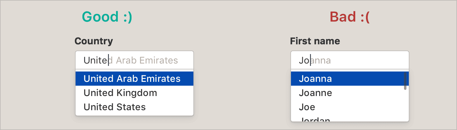
The bad: a person's name can be literally anything, so trying to suggest options is probably not helpful, especially once you start including non-English languages in your product. It also might imply to a user that they have to select one of your pre-defined names, instead of choosing their own. A simple text input field would do fine.
Tag Input Field
This input is similar to the above, but allows the user to select more than one option. This input may limit the user to some predefined options. Alternatively, it could behave like an email address field - suggesting potential options, but allowing any input.
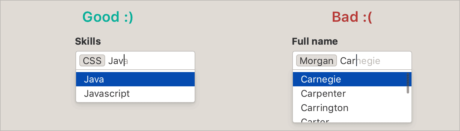
The bad: as above, a simple text field is best for inputting a name.
Checkboxes
Checkboxes are used when you want the user to select any number (including zero) of predefined options. You can also use one to agree or disagree to a single option.
Checkboxes traditionally are shaped as squares, while radio buttons are circular. Feel free to implement your own styling, but keep the shapes roughly the same or you’ll confuse your users. Also make sure that clicking on the text label will toggle the checkbox or radio button.
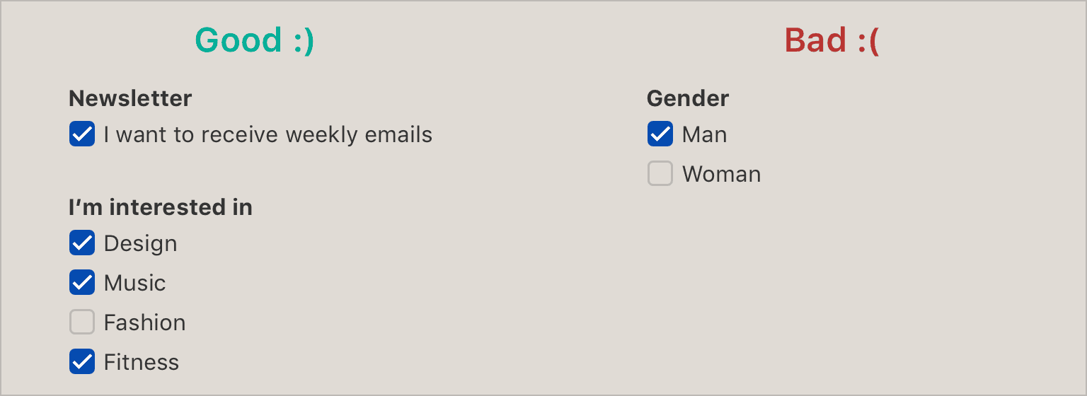
The bad: you probably want the user to pick a single gender, so radio buttons or a button group would be better choices.
Toggles
These are essentially the same as checkboxes, but they resemble a real-life switch, which can be a bit more intuitive. They generally mean “On/Off”, not “Agree/Disagree”.
Toggles are also a bit easier at a glance to understand, as they’re brightly coloured, and always positive. A ticked checkbox may be negative (eg. “don’t send me promotional emails”), but a green toggle always means “enabled”.
Toggles are very easy to implement using pure CSS. Learn how.

The bad: a toggle means “on/off”, not “agree/disagree”. You're better off using a checkbox here.
Radio Buttons
Radio buttons and checkboxes are often erroneously interchanged. While checkboxes allow the user to select any number of predefined options, radio buttons are used to force the user to select exactly one predefined option. Once selected, they can’t be unselected. If you need the user to select exactly 1 or 0 options, you may use a set of radio buttons and include an option “None”.
Radio buttons are ideal when you have a small amount of options, about 4 or 5. Smaller than that, you’re probably better off with button groups. Larger, and you’re better off with a select dropdown. You may also use a radio button when you’ve only got a few options when you need long labels that won’t fit in button groups.
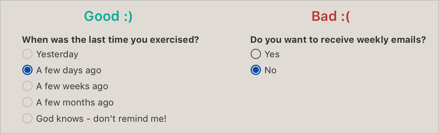
The bad: this one isn't broken, but since you have a single option that asks the user to agree or disagree, a better option would be a checkbox with the label “receive weekly emails”.
Button Groups
Button groups are to radio buttons what toggles are to checkboxes. They’re essentially radio buttons, but they’re a little more intuitive, as they borrow the affordance of real-life buttons better than traditional digital radio buttons do. They’re great for when you only have 2 or 3 options to choose from, all with short one-word labels.
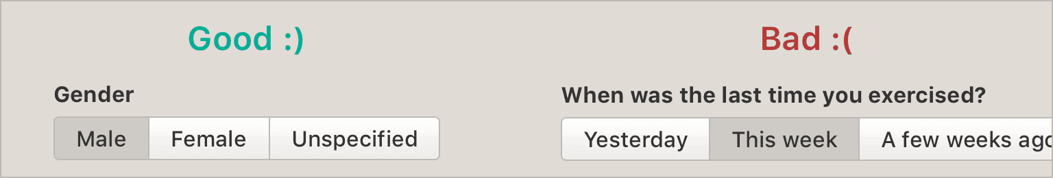
The bad: this one is fairly obvious - the label names are simply too long to fit inside buttons. Radio buttons are a better choice.
Update: a few people pointed out that having just 2 buttons in a group can be confusing, as it can be difficult to infer which button is pressed and which is unpressed. If you have 3+ buttons, this is no problem. Or if you’re using a more skeumorphic visual style, this also alleviates this issue.
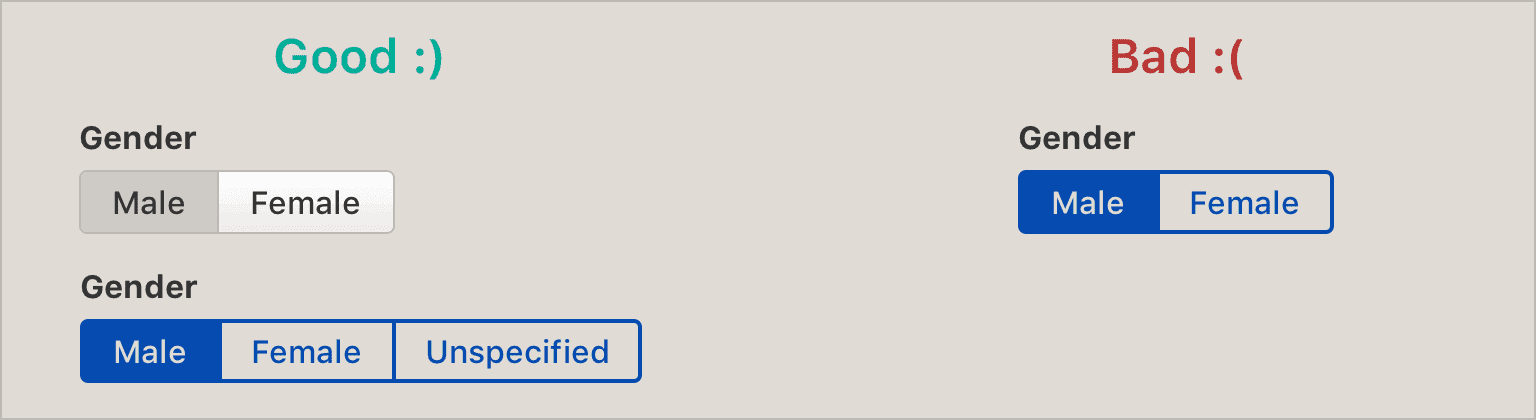
It's easy to see which button is pressed on the left-hand examples, but it's pretty confusing on the right-hand example.
Select Dropdowns
If you need the user to select exactly one of many options (too many for a set of radio buttons), then a select dropdown is the ideal choice. However, if you have lots and lots of options (eg. “Select your country”), avoid a select dropdown and use an auto-completing input field instead.
Select dropdowns hide all of the options from the user until opened, and even when opened, only show some of the options until scrolled. This means that they’re good when the user doesn’t need to know all the options available. If they must know the options they’re not selecting, a set of radio buttons is better.
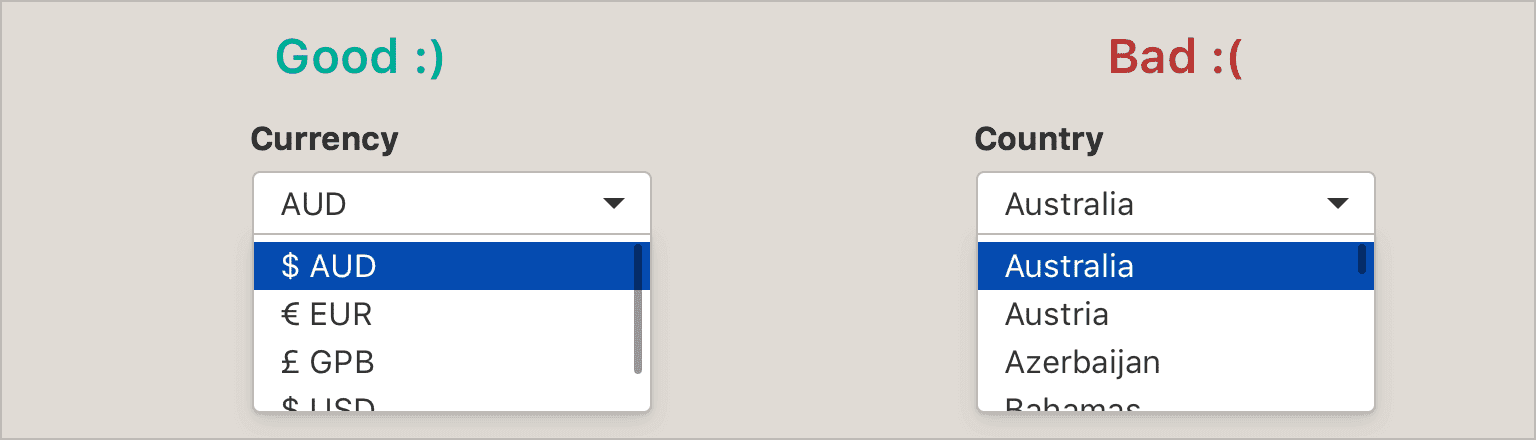
The bad: the difference between the good and bad here is in regards to the number of potential options. Here there are 5 or so currency options, but over a hundred country options. It's unwieldy to scroll through so many, especially on mobile. An auto-completing input field is a much better choice here.
Multi-select Dropdowns
Where select dropdowns are similar to radio buttons in forcing the user to select exactly one option, multi-select dropdowns are similar to checkboxes in allowing the user to select any number of options. You would use a multi-select dropdown when you have too many possible options to use inline checkboxes. However, as with select dropdowns, if you have lots and lots of options, it’s better to use a tag input field.
Unfortunately, the stock HTML multi-select is awful - it doesn’t save any space, and is very unintuitive (you need to shift-click to select multiple elements). A plugin like Bootstrap Multiselect is a much better implementation.
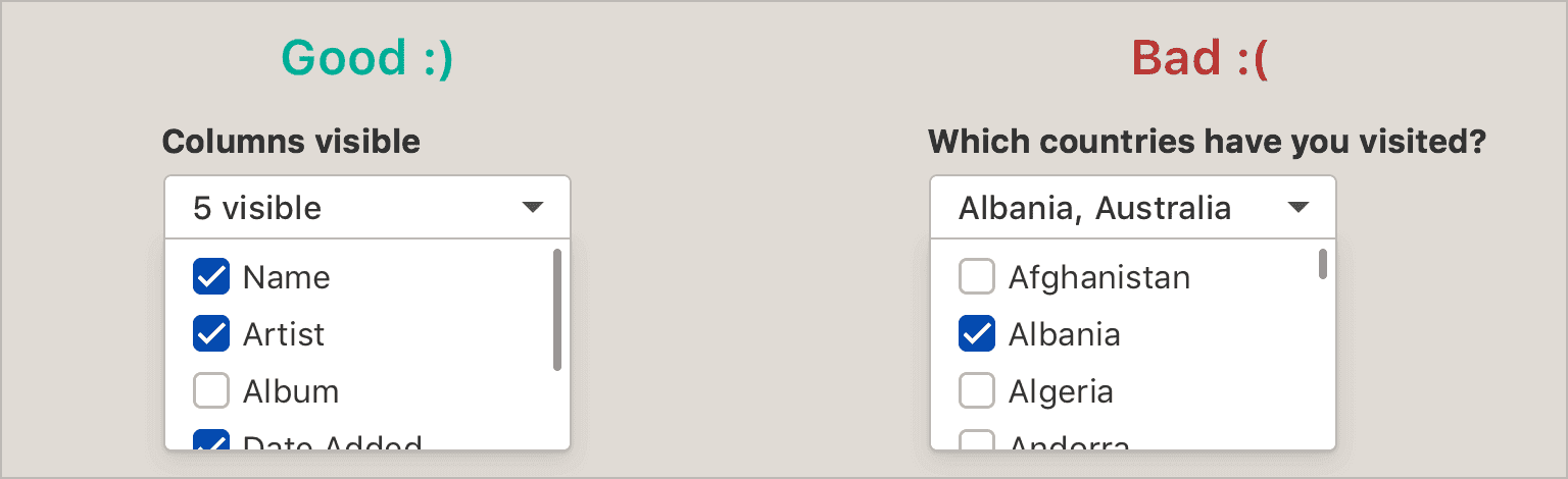
The bad: again, there's simply too many options in the example on the right. A better choice would be a tag input field.
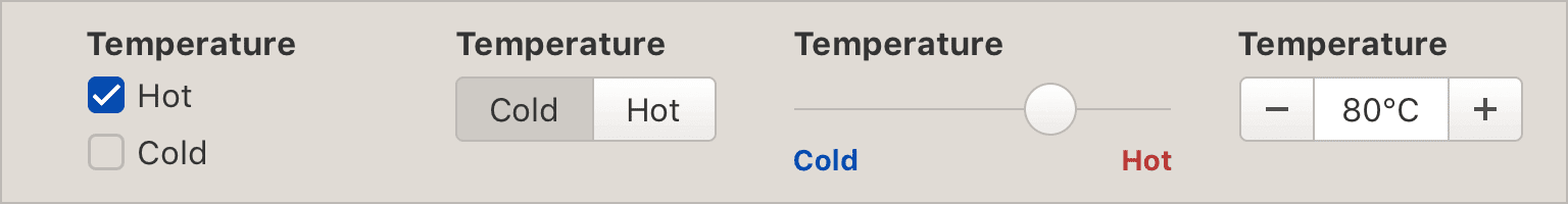
Range sliders
Range sliders are good when you need the user to enter a number within a minimum or maximum limit. They’re also good when you want the user to set the minimum or maximum limit. Range sliders are not precise - you should only use them when “close enough is good enough”. They also enforce limits, so they’re not good for open-ended numbers inputs.
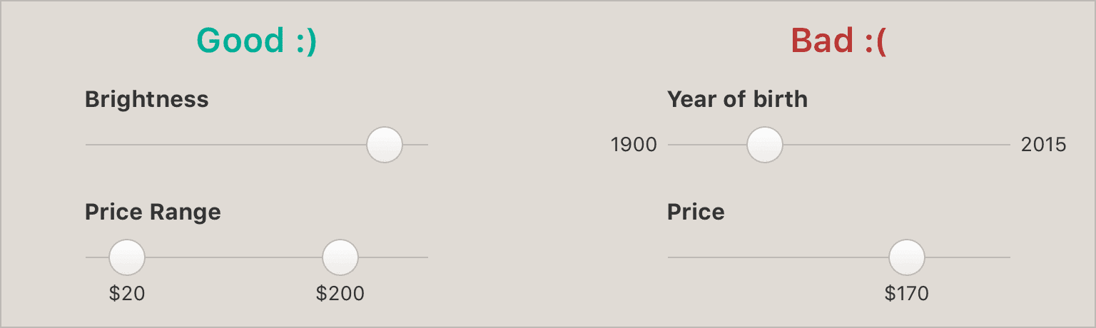
The bad: a range slider is too imprecise to select the year of birth, which needs to be an exact number. A number input field would be better there. And while a range slider might be ok for setting a price, it enforces a maximum limit, which might not be appropriate. Additionally, if your maximum limit is high, it becomes difficult to set low prices, since the slider is linear. For example, if the maximum limit was set to $10,000, selecting $10 rather than $15 might be less than a pixel difference. I find this to be a constant frustration when using AirBNB because of this.
Steppers
These are a quick and easy way to let users manipulate a number. They’re only useful if the user will be deviating from the default setting by 2 or 3 whole numbers. Any more than that, and this will be much more cumbersome than a simple input field, or even select dropdown.
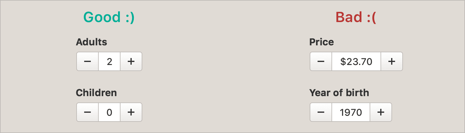
The bad: it's not a good idea to use steppers for non-integer numbers, like $23.70. And when the user could be deviating from the default by a lot, steppers require a lot of additional effort. If the user was born in "1940", for example, they would need to tap "+" 30 times. A simple number input field would be much more user-friendly.
In Summary
While we already know many of these rules intuitively, it’s easy to forget them in the rush of designing in a startup. These rules aren’t prescriptive, they’re guidelines to get you started. They’ll work in most cases, and when they don’t, that’s when you prove your worth as a designer.
One of the best ways to design a great product is to increase the design knowledge of the entire organisation. Rules like these are share with your developers, so that they can use best practices when developing forms without needing to bother you every time.