
Morgan
Iterative Design in Action
We always talk about design being iterative, but so often we only see the end result and not the many steps it took to get there. Often the end result looks simple and obvious, like it could have been designed in minutes. But simple and obvious is usually very hard to get to. A bottom tab bar is hardly a revolutionary concept, but Facebook took 6 years to get there, and Spotify only got there last year.
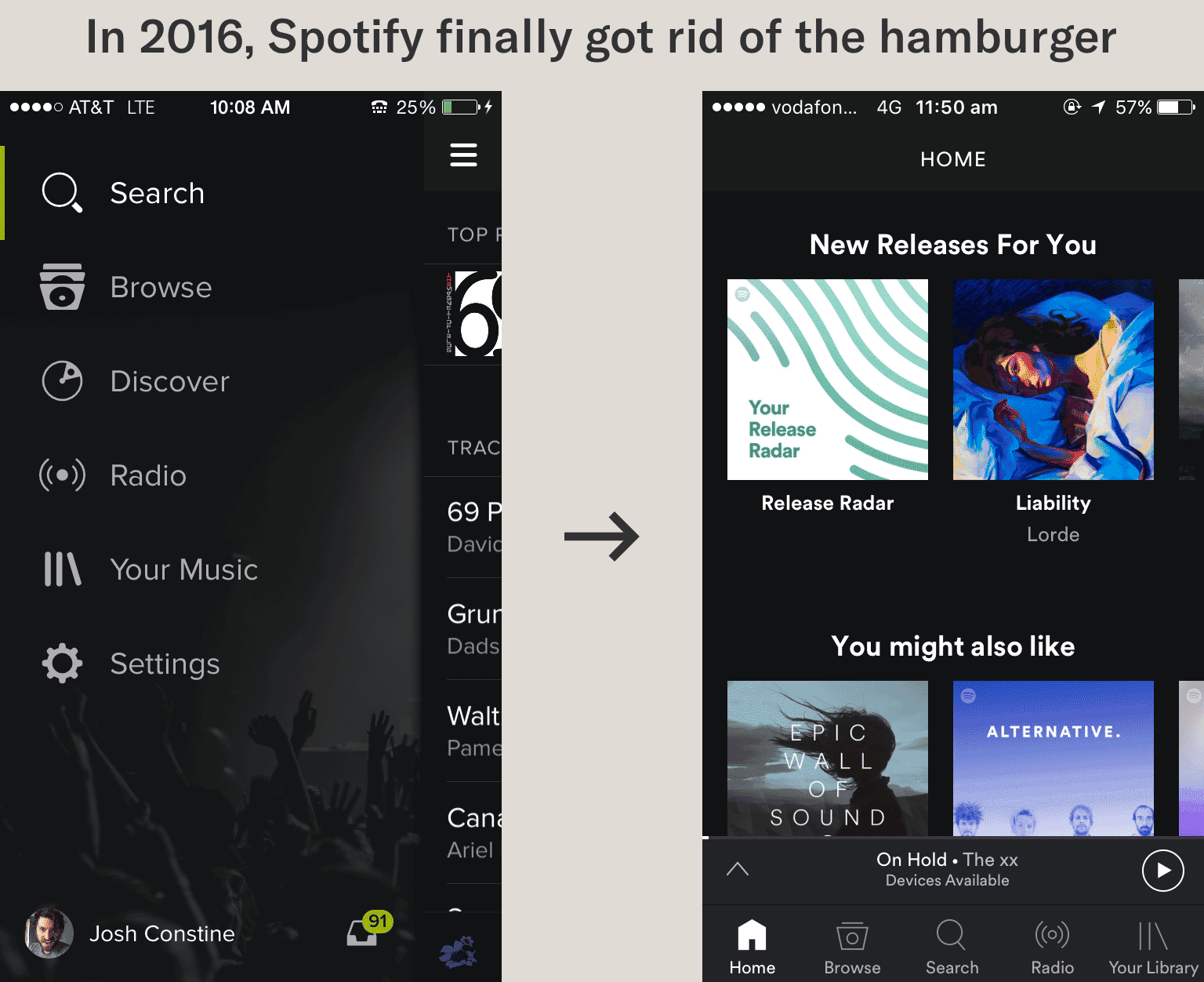
Spotify only got rid of their hamburger menu in 2016.
So instead of just showing you the end results here, I want to take some time to shed some light on what my iterative process is. Because if you work with me, I’m not going to give you the exact same end result as I’ve given another company. But we’ll be using a similar iterative process to approach your unique problems.
The Project
SurgeMaker GPS is a complex web application that is equal parts data visualisation and data collection. The data visualisation starts as broadly as possible, and has signposts every step of the way to say “Hey, check out this weird thing!” and prompt the user to dive down deeper. And eventually, after diving deep enough, the user will hopefully gain some actionable insight.
We didn’t approach data visualisation as just “turn this data into a pie chart” because you don’t need a designer for that, and it’s usually not enough to generate insight. Instead, for each set of data we created a widget – this might be a graph, a collection or graphs, or graphs alongside other material. Here I’m going to go through a single iteration in the design of one of our widgets, the Trending Health widget.
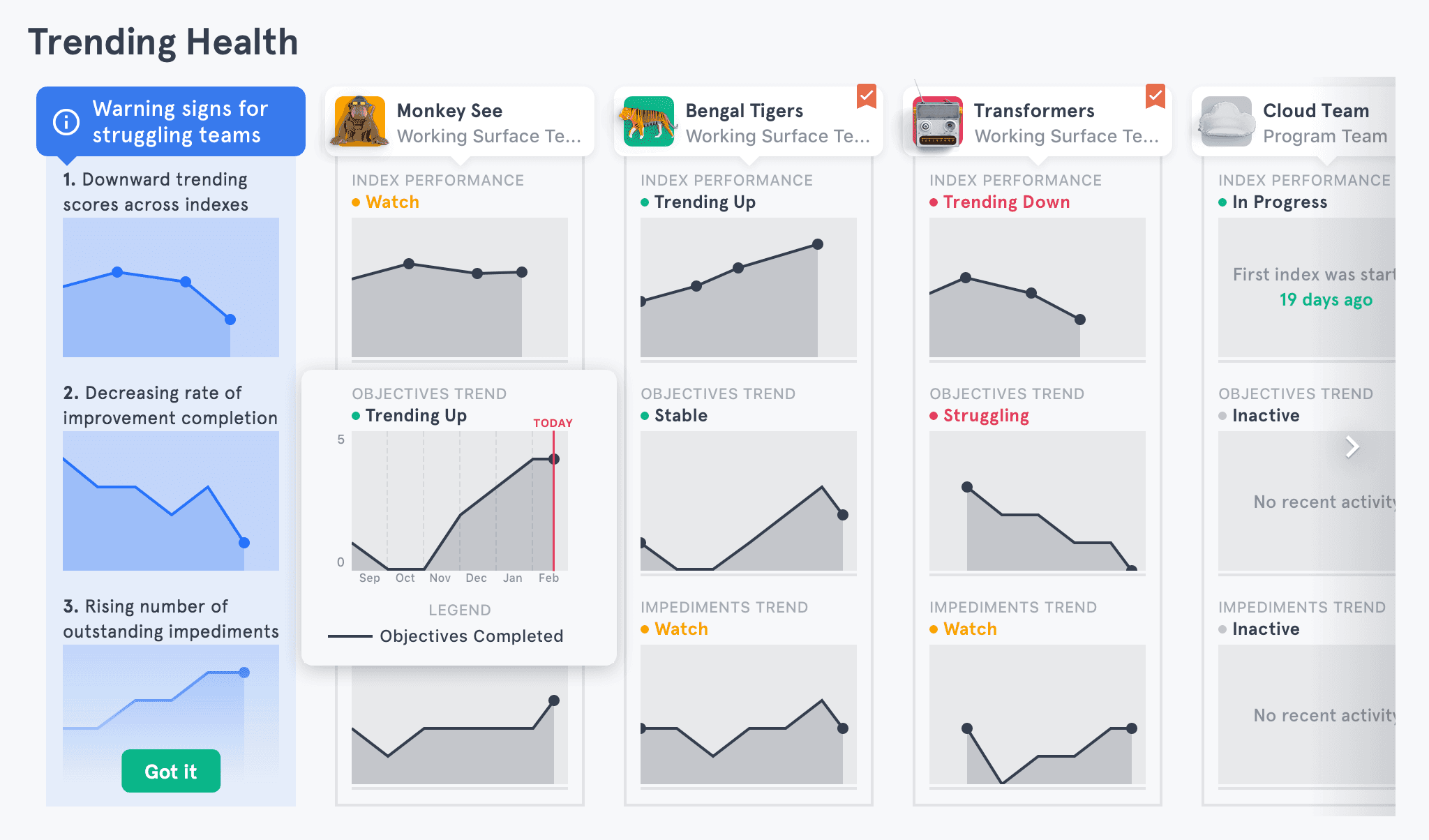
Before
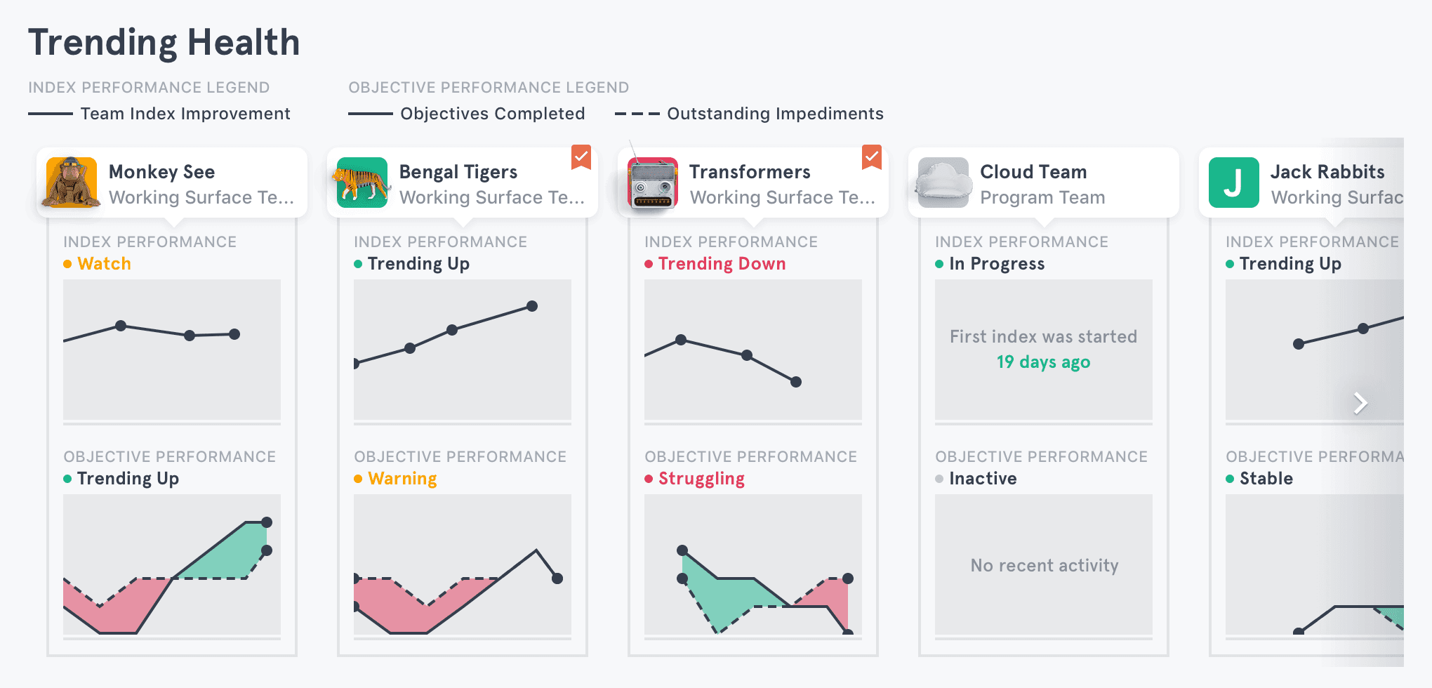
So here we have one of our widgets. Each column represents a team, with the team’s identity up top and the team’s performance data below. At a glance, I can tell that the “Transformers” team needs looking at - it’s trending down on Indexes, and struggling on Objectives.
We did some user testing on this widget and came back with a few discoveries:
Every single user realised that you could navigate to the team by clicking on the card at the top of the column
Some users were unsure of the timescale of the graphs - how far back in time was this showing?
Not a single user noticed the legend
and because of this, every user was confused by the Objective Performance graph. “What does the dashed line mean?” was a common question.
The first discovery was a great affirmation/relief. We had created the visual design with the idea that “things that are 3D are navigable items” and “things that are flat are generally just visual”. And our users confirmed that this decision was a success.
The second discovery was a problem we were already aware of. We had tried putting axes on each of the graphs, but the widget soon became very overwhelming.
The 3rd and 4th discoveries were worrying. We were aware that the Objective Performance graph was a little unusual, but hoped the between the legend and the positive/negative colouring, users would be able to work it out. But they weren’t. And it was our fault.
The first thing we tried, as a quick fix, was to highlight the legend on hover.

We tested this solution. Guess how many people noticed the legend now, with just this easy fix?
No-one. Not a single person even saw the legend, let alone correlated it with the graph.

Our users were possibly suffering from tunnel vision, and were essentially seeing this. They might have been saying to themselves, “Huh, that keeps highlighting yellow. Weird.”
In light of this new knowledge, we took advantage of our users’ tunnel vision, and displayed the legend exactly where they were looking. As an added bonus, this now gave us a way to display our axes.
We tested this design, and now every single user noticed the legend.
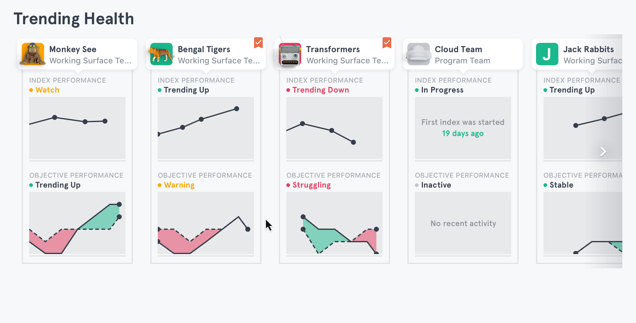
We went from not a single person understanding the graph to everyone understanding it with this redesign.
And yes – by looking at a flat image, it’s not obvious that you should hover over the graph to see a legend or axes. But in normal interactions with the app, such as swiping to see more teams, users inevitably stumble across this feature.
After testing our overlaid-legend-and-axes solution, we hoped that now, finally, users would get the Objective Performance graph.
But they didn’t. Which was fair enough, it was pretty confusing. Especially because often the two lines would overlap and become one. Users would ask, “Why does this team have one line, and this other team have two lines?”
So we set out to redesign that. We came up with a few solutions, picked the two best, and tested them against each other.
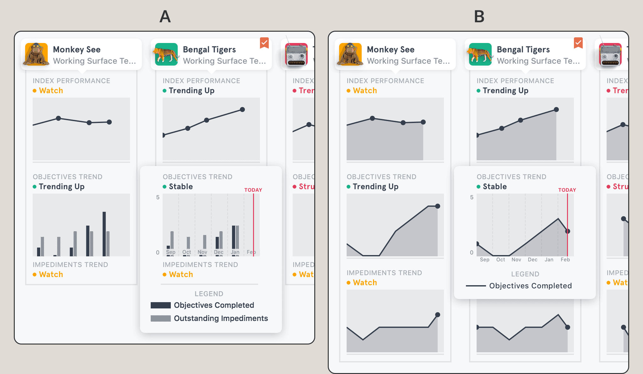
There were pros and cons to each of these designs.
In the A solution, users could see the inverse relationship between Objectives and Impediments easily, but the graph is a little overwhelming and possibly confusing.
In the B solution, our main concern was that in the first two line graphs, “up” means “good”, while in the 3rd graph, “up” means “bad”. We were worried that users would see a rise in the 3rd graph as good.
After testing these two solutions against each other, we decided on the line graph solution, for a number of reasons.
Although “Objectives” and “Impediments” are linked, they aren’t intertwined. By placing them in the same graph, we were forcing a connection that sometimes might not be there, leading to false insights
In the bar graph solution, the user needed to learn 2 different types of graphs to read this widget. In the line graph solution, the user learns 1 type of graph, and applies that knowledge 3 times.
The line graph solution was significantly easier to develop – we had already done the work with the first line graph.
One thing that was confusing our users was that in our new solution, in the first two line graphs, “up” meant “good”. But in the 3rd graph, “up” meant “bad”. This was something we chose to solve with onboarding.
Thanks to our user testing, we knew that a few things about this widget were pretty intuitive or at least easily discoverable, and so didn’t need explanation. Every single user intuited that you could click on a card to navigate to a particular team. And every single user stumbled across the legend/axes overlay when hovering over a graph. So we didn’t need to worry about these in our onboarding.
Our onboarding solution itself went through several revisions, but I’ll fast-forward a bit here. We started with the main insight that this widget aimed to reveal: which teams are doing ok, which need attention, and how can I tell them apart?
We took inspiration from subway signs that many people see everyday, and are used to taking directions from. Notice that they don’t say “Don’t put items in the doors”, but give people a reason to do it by explaining the benefits or consequences of that action - “Items trapped in the doors cause delays”.

This language is really useful when trying to encourage users to behave in a certain way. Samuel Hulick of UserOnboard loves little microcopy that explains why users should give up their email addresses or personal information.
Using this language, we iterated a few times and eventually settled on the following design.
This design, despite being quite contained, communicates a number of important things:
It explains to the user how to use the widget (by looking at the three graphs together, not in isolation)
It explains to the user what benefits they can gain (they can identify which teams are struggling)
It helps clarify confusion surrounding that 3rd impediments line graph
After
At the beginning of this adventure we were concerned about 4 different problems with this widget’s design. One of those we had already solved (and confirmed with user testing), but three still needed to be solved in this iteration. Let’s see how we did:
✅ Every single user realised that you could navigate to the team by clicking on the card at the top of the column
✅ Some users were unsure of the timescale of the graphs - how far back in time was this showing?
✅ Not a single user noticed the legend
✅ and because of this, every user weas confused by the Objective Performance graph. “What does the dashed line mean?” was a common question.
4/4. Not bad 🙂