
Morgan
Affordance for Overflowing Content
When we observe how users interact with our designs, we’re often surprised by their behaviour. They don’t seem to understand aspects of the design that are obvious to us, and react in ways that we struggle to predict.
When we design, we have a clear mental model of the layout in our minds. We see not just the 2D pixels that are visible on-screen, but where each element is positioned in virtual 3D space. However, when our designs don’t convey this virtual layout well, our users get confused and act in ways we don’t expect - because they’re acting on less information than we are.
An intuitive design relays all necessary information to the user, in ways they already understand. The way we do this is through affordance. In case you’re not familiar with the term, affordance refers to the properties of something that intuitively imply its functionality. For example, a physical button is raised and separated from its surface, suggesting that it can be pushed. Skeuomorphism, which has received a bad rap lately, allows us to borrow affordances from real-life - a digital button might borrow this affordance by having a gradient, or a shadow underneath.
For a real life example of affordance, have a look at the photo below. The fact that they have to label how to use a door means that it’s not a good design. The bars on the ‘push’ side of the door provide a misleading affordance to pull - you need a handle to pull, but a handle is useless when pushing.
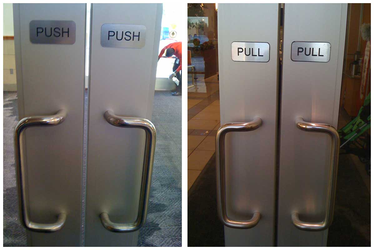
Sourced from Affordances: Designing for action.
When I was designing Deputy 3, our previous interface had some very long forms, and many of our users were using tiny laptops or iPads. This meant that they would see a few form fields on the screen, and would have to scroll to see the rest, and to see the “Save” button at the bottom.
We at Deputy knew the form was long, and where the buttons were placed, and so we never had any issues internally. But we got constant customer support calls from users not seeing the “Save” button, and getting frustrated at not being able to save their forms. Our design wasn’t intuitive because the form had no affordance that encouraged the user to scroll. Let’s run through a few ways to provide that affordance.
The scrollbar
The scrollbar was a fantastic design concept. It let you:
know when you could or couldn’t scroll
know how long the content was
know how far through the content you were
navigate through the content much faster than scrubbing the mouse-wheel
I say was, because in the relentless pursuit of minimalism, it’s been reduced to a shell of its former self. Now, on many devices, it’s completely hidden until you scroll. So if someone views your website on a Mac, or any mobile device, you can’t rely on this affordance to encourage them to scroll.
Cut-off content
This is, in my opinion, the best way to indicate scrolling. It’s very intuitive, and doesn’t take up any space, so it’s great for user interfaces. Take a look at the following two examples:
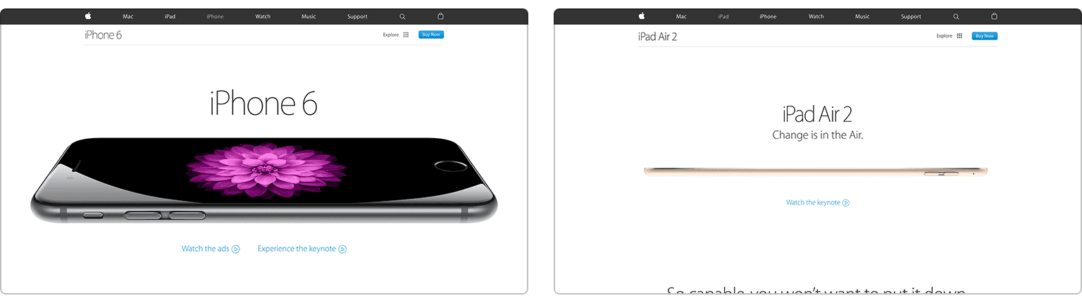
The example on the left is completely contained within the screen, with nothing that encourages you to scroll. But the example on the right clearly has more content below the fold. And it was intentionally designed this way - resizing your browser always keeps just the top half of the sentence visible - check it out.
If you’re wondering how to do this in CSS, the simplest way is to use vh units - an area with 90vh will always take up 90% of the browser’s height, so you’ll always have that bottom 10% visible.
A ‘scroll me’ icon or button
You might have noticed a trend lately with websites telling you, quite literally, to scroll your mouse. A page that’s fully contained within the screen looks great, and lets us achieve a more editorial design, but needs to have this alternative scrolling affordance.
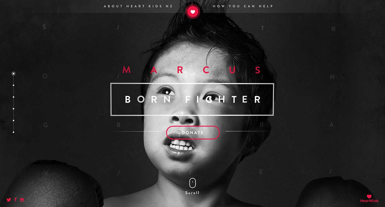
Unfortunately, it still shows a mouse icon when you visit on a tablet. Sourced from Heart Kids New Zealand.
This is a perfectly fine solution, but it has a very limited use. They’re not much use in tight user interfaces with little space to spare. And even on full-page sites, they don’t work well if they’re not the primary action, like the website below.
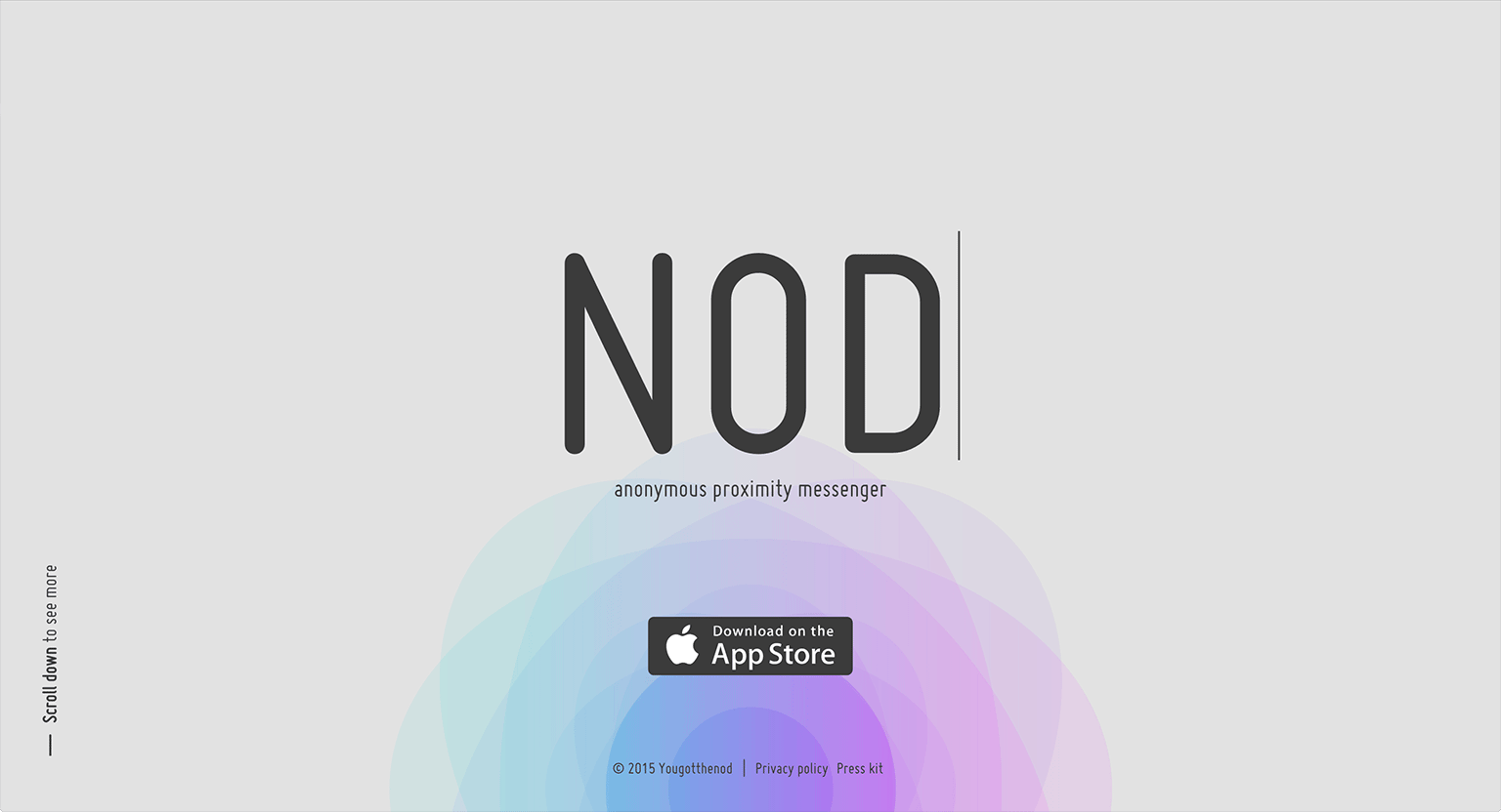
Did you notice the sideways text on the left telling you to scroll? Sourced from NOD.
Shadows and gradients
What if we have a user interface for a web application that’s accessible on anything from desktops to mobile phones? We can’t rely on the scrollbar, there’s no space for an icon saying “scroll!”, and our design is necessarily responsive. It’s easy to ensure that your content gets cut off mid-way when you’re designing for a set screen size, but responsive design means you have no control over screen size.
Let’s go back to the problem I was working on for Deputy 3. The first thing I did was separate the buttons, and place them in a footer that always sat on top of the form. No more were users confused as to how to save their form, at some screen sizes the form fields would be cut off mid-way, providing a clear affordance for users to scroll to see the rest of the form. But not always. And there was nothing I could do about this - fixing it on one screen size would break it on another.
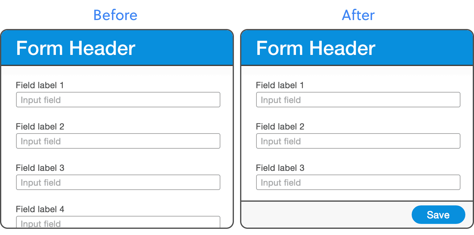
You can understand why people couldn't find the Submit button on the left. It's better on the right, but it looks like the form only has 3 fields, because the screen size happens to be so it doesn't cut any content off mid-way.
Remember at the beginning, when I said that we can show that a button is above the surrounding content by using shadows and gradients? Here our header and footer are above the form, so we can use the same solution. And to make it even clearer, let’s make it so that when you reach the top or end of the form, and there’s no more content sitting ‘underneath’, the shadow disappears.
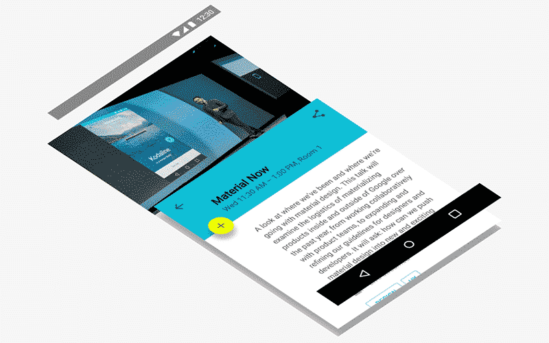
Google I/O App Layer Visualization by Roman Nurik.
There are lots of implementations of this solution on the web, but they all use JavaScript. This means that for each scroll event, the browser needs to do a bunch of maths to calculate whether you’re at the top of the list or not, which is very expensive. So let’s do it with CSS.
The way this works is by having two gradients for each shadow. The dark gradient is always visible just below the header, and above the footer. And at the top and bottom of the list, there’s two white gradients, positioned higher than the dark gradients in z-space. So as these overlap, the white gradient slowly covers the dark gradient. Also, unlike the binary on/off JavaScript solutions, it’s a gradual change - try scrolling slowly to see what I mean.
Affordance is a principle you can apply to any interactive design. A design becomes intuitive because of affordance, because the user already knows how to interact with it. You don’t need to put labels everywhere explaining how to use your design. Which is good, because they wouldn’t read it anyway.